Nav Ad Widget - Mobile

Collapse

Nav Ad Widget - Desktop

Collapse

Announcement

Collapse
No announcement yet.

SIHH Report 2009 -2012

Collapse
X
 
  • Filter
  • Time
  • Show
Clear All
new posts

  • abcd
    replied
    Originally posted by Watcha View Post
    They should go slow like Rolex.

    Time is luxury, luxury takes time.

    Growth should take a back seat.

    From the 2012 postings. I feel that panerai is squeezing their juice hard.
    Can't agree more,I concur

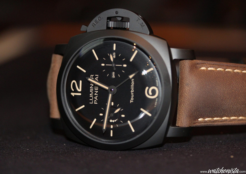
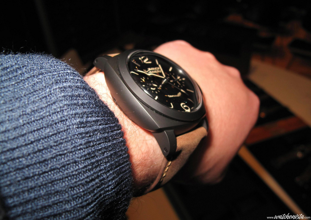
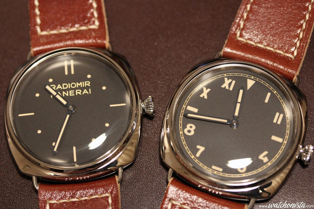
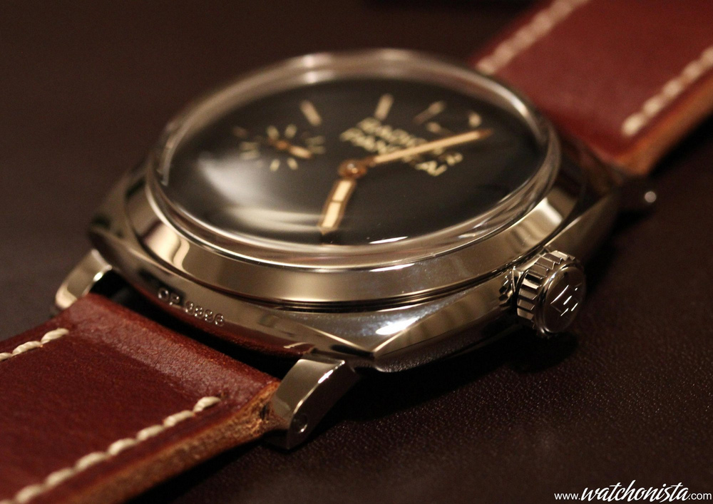
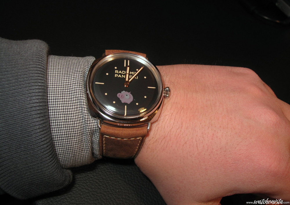
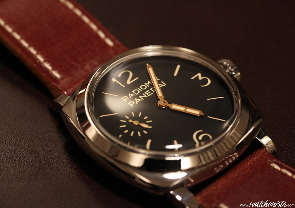
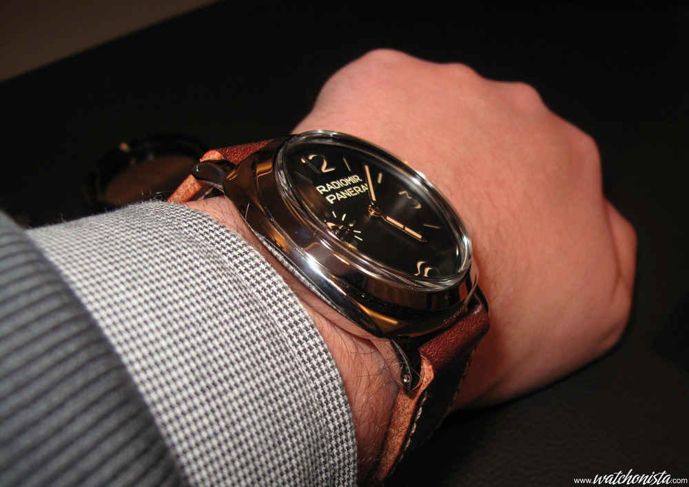
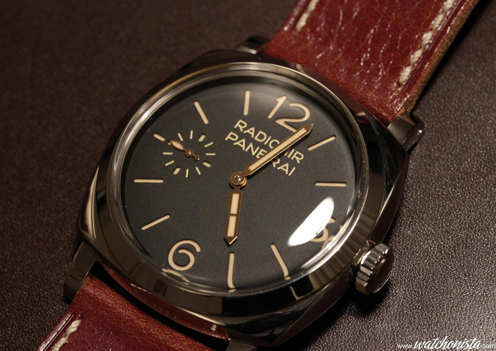
    Nice line-up though....

    Leave a comment:


  • rizoma
    replied
    Is the IWC Aquatimer Chronograph "Galapagos Islands" 3767 worth getting ?

    Leave a comment:


  • Pifpaf
    replied
    Transforma Rivage Chronograph

    The photograph, bending under the weight of his camera, his eyes blinded by the flashes, sometimes reaches a level of exhaustion almost hallucinatory. To be honest, the first time I saw this Tranforma Rivage Chronograph, I thought it was a mistake. In the flow of dressy neo-classic watches of PF, this watch looks like a UHO, as if Mercedes-Benz produced a G Class . At first, one could think that a specialist of aerospace/professional/adventure watches, like Sinn or Fortis, had lost their way in the Vallee de Fleurier rather than in the Guangzhou valley.
    Then, when one looks at the details, it is obviously Fleurier's quality: it is beautiful, it is very well finished, but most of all, it does not lapse into the technical pedantic arrogance. Joy, happiness.
    Regarding the caliber, it is far from a 7750 with a dubious pedigree: the watch is powered by the PF334, 50h power reserve, 28800v/h (but with a display "divided" by 2, (down to 1/4th of a second instead of 1/8th), 68 jewels, with an overall Fleurier quality. In fact, the chronograph is 43mm across with a large aperture. The external case is made of titanium, while the internal case is made of woven carbon fiber (because of this Transform-ability, the watch is waterproof up to 30m only, versatility opposed to water resistance, it is a matter of choice !)
    Yes: the internal case. Because the watch is "convertible", it can be fitted in the titanium wrist frame as well as in a steel pocket watch case. The chronograph's secondary dials are also made of carbon fiber while the main dial is made of graphite, to stay within the realm of carbon. The light effects are magnificent and highlight the stylized map of the globe. While you got the explanation for "Transforma", you are still missing the one for "Rivage": it is a limited edition watch (100 copies), an homage to the Swiss sailor Bernard Stamm, whose new boat is made of carbon fiber.
    Let's hope that this success will be the inspiration for a new line at PF, as much as this aerospace/adventure style is despised by the great brands, wrongly so.


    Toric Ovale
    At SIHH 2010, there was this magnificent piece from Vardon & Stedman brothers, an oval shaped pocket watch!
    It was exceptional because it featured telescopic hands that retract following the railway’s curvature, a display that is a feat dating more than 200 years and was never reissued in the same way.
    When I saw this watch, I tried to find any modernized version on the net. Nothing! It is one of these moments when you wish you were a watchmaker! Two years later, Parmigiani proposes a veritable tribute to this pocket watch, the Toric Ovale; PF creates a watch that does more than mimicking the original design, it reproduces the complication altogether!
    It is also one of the most thoroughly shaped watches, as it features an oval shape down to the tip of its hands.
    The hands retract at 3 and 9 o’clock and extend at 12 and 6 o’clock. For the large hand lovers, it is rapture: not only are they large, they grow even larger!

    Based on its Vaucher/PF110 caliber (8 days Power reserve, set at 21600v/h), the Toric Ovale encloses the PF114 shape movement, (8 days Power reserve as well), which features a chiseled floral ornament.
    The display complication that pulls or pushes on the hands in order to alter their length is relatively thick, which is noticeable on the Power Reserve and Date apertures’ bezels, respectively sitting at 12 and 6 o’clock.
    To stay in the realm of the dream, one could imagine, in the future, a "Grande seconde" that would follow the same elliptical curve.

    Of course, in watchmaking, technique is nothing if not served by a flawless design. The watch is an absolute aesthetic achievement; a single criticism though, the aperture that shows the movement on the back of the case is vaguely potato-shaped, when one could have expected it to be fully oval … To achieve an oval watch is always a challenge, because supermarket watches sometimes sullied this shape, a little kitsch… In this case, the watch is beautiful, as it takes after the Bauhaus, the Art Deco (a fundamental influence at PF). The lugs designed by the brand from Fleurier never fit better than on shaped cases, akin to the Bugatti Super Sport (the watch); they perfectly suit the offbeat case design.
    As you can see on the wrist shot, it is rather a Dandy’s watch; the lugs are tapered at the level of the spring bars, to follow the case’s curvature. With regards to the dial and the hands, it is a real surprise: the indexes are a reminder of the famous Panerai’s «sandwich dial», and provide a quite adaptable sporty look to the watch.
    With the «Grand feu » enameling finish, one obviously stays in the realm of chic. Akin to the indexes, the extendable hands are blue, the color of oven treated titanium, a highly complex technique mastered by few.
    Now that this technique is acquired, I want to see some future Parmigiani featuring blued titanium dial…
    The oval is pervasive on the watch, from the hand’s tip to the lugs, as well as through the numbers, the watch benefits from a hard-liner geometry. One could almost regret that the oval balance has not yet been invented!


    Dragon Clock
    Chinese market my love. China is obviously the new Sinorado of the Helvetian watchmaking.
    And this year is The year of the Dragon.
    The Dragon is a fabulous creature, more than in any other mythology, in that it borrows from the camel, the tiger, the eagle and the demon, as well as other creatures.
    The "Dragon" clock by Parmigiani is based on the "Le chat et la souris" mechanism. "Le chat et la souris" was extremely sober, as it borrowed a lot to Art deco with an asserted minimalism.
    If the profusion of precious material could make the clock look heavy, but the dynamism of the clock remains, the dragon's posture is energetic and it looks absolutely ferocious.
    It runs behind the pearl of knowledge with as much energy as the cat ran after the mouse.
    The dragon's body is made of gold and silver. The scales are made of jade, 585 pieces fitted depending on their color in order to produce a shaded effect. The eyes are made of ruby, the tongue is carved in cornelian and the claws are made of white gold. The pearl of knowledge is set with diamonds, sapphires and rubies.
    Of course, the dragon stays with all the traditional Chinese mythology codes, as it is also the case for the characters, displayed on the base made of rock crystal. Following the tradition, each of these characters represent 2 hours in base six. The pearl of knowledge jumps 6 times per hour, while the dragon does the same once over the same period; Of course, it takes enormous amounts of power to move this mass of precious materials.
    If the theme borrows a lot from Chinese mythology, it is also the case for the making.
    Like the Dragon, which is a mosaic of animals, the clock is a mosaic of artwork.


    Rather than an exclusive presentation, I chose to dwell upon the finest pieces of PF, because the most surprising feature of the brand from Fleurier is variety.
    While many brands specialize in a single product, PF does the exact opposite, from the neo-classic watch, to the style of independent watchmakers, from the sports watch with Grande Complication to the clock worthy of the Guinness book.
    Parmigiani is not entangled in an heritage, this young brand has still everything to play for, and that’s its strength.

    Leave a comment:


  • Pifpaf
    replied
    2012 SIHH: Parmigiani Fleurier novelties

    Tonda 1950

    The Parmigiani Fleurier Tonda 1950 fits into a big trend of the Sinophile watchmaking; the (colossal) Chinese market is fond of plain Hours-minute-second with a classic diameter.
    Yet, in this field, there were a tremendous number of reissues of pieces from the 50’-60’s; many brands merely reproduced these codes without the era’s magic.
    However, certain brands, like Lange & Söhne or Vacheron Constantin, make very fine things in this vein.
    Parmigiani recently took up the Quest for the Bauhaus’ horologic Grail: the quintessential horologic layout.
    Minimalism is too often mistaken for dullness and the functionalism for the banality.
    If making a white classic 3 hands is easy, it is a bit, or even a hunk more difficult in black…
    Many brands make (or subcontract) superb powdered or grained silver;
    They produce « liquid-paint » enamellings (©www.Watchonista.com), eggshell whites, “Silver-Surfer” silvers, more than perfect whites…. In short, some fine white which conveys quality.
    But regarding the black, it is despairing. Dull colors, light sinks, corny textures on a B-uhr made by a “little” German, the final result is poor in terms of quality.
    Weak product management? Lazy suppliers? Color more difficult to master?
    With this Tonda 1950, Parmigiani Fleurier demonstrates that it is possible to achieve a beautiful black.
    This Tonda’s black is surprisingly powdered/shimmering/eggshell (just wear the watch, you will understand).
    For the lovers of more sportive watch (without white dial), it is bliss.
    Because the vivacity of the dial’s black combines with the distinctive PF lugs and the sharp hands, to produce a very dynamic look.
    As a result, the watch seems larger than the advertized 39mm… Still in this idea of “perceived quality”, the brand name circled in gold combined with the narrow indicators complete the effect.
    Even if the white Tonda 1950 is a success, it is with the black version that Quadrance (PF’s dial department) demonstrates its Know-how. Sportive, dressy, neo-classic, it is an achievement.


    Tonda Retrograde Calendrier Annuel

    Nowadays there is a crack in the very high-end watchmaking, between sports-chic (Royal Oak, Overseas, Nautilus…) and classic dressy watches.
    This distinction was created by some big wigs of the Helvetian design, such as the late Gerald Genta.
    And since the 70’s, the design of high end classic watchmaking collections almost hasn’t evolved aesthetically.
    But nowadays, Parmigiani Fleurier punches a hole in the establishment of the high end dressy watches, by modernizing the classic codes. Hence, the movement of the “Tonda Retrograde Calendrier Annuel”, completely designed, assembled and finished in the Parmigiani-Fleurier manufactory, represents the horologic “swissness” pinnacle.
    The annual calendar movement is of course automatic, to allow the use of a watch winder Even if the circular-graining of the 22K gold balance is superb, one could almost regret that it blocks the light which perfectly enhances the subtle Côtes de Genève and beveling. The dial is a surprise: a neo-classic design featuring grainy silver at the center and powdery at the periphery; you will notice the many details, especially the PF logo circled with gold.
    But the centerpiece is of course the Grande date, indicated by a retrograde hand instead of an aperture.
    The day is indicated at 9 o’clock and the month at 3 o’clock, when the moon phase for the Northern and Southern hemisphere sit at 6 o’clock. This super-accurate complication only has to be adjusted every 120 years.
    The watchcase is 40mm across, but the exclusive and dynamic lugs, together with the Hermes wide alligator sports wristband make it look like a 42mm.
    The bet on the Tonda line seems to be worthwhile for Parmigiani: that of having the Swiss conservatism evolve while keeping with the tradition. It is not really a novelty, but this watch is rare and interesting enough for us to dwell upon, lengthily!


    Bugatti Super Sport

    In 2004, Parmigiani presented the Bugatti Type 370 (which is the top speed in Km/h of the first Veyron), featuring a first: a movement with a transverse architecture, just like a super car engine block.
    While the actual trend is to produce movements as large and as flat as possible, PF did the exact opposite: a movement as small and as thick as possible, in order to fit it transversely in a watch case which is reminiscent of the hoods of the Bugatti from the 30's, such as the famous "Type 35" and "Type 41”.

    In order to satisfy the increasing market and to pay an ultimate tribute to the Bugatti Veyron, the most mythical
    Super car from the 2000's, PF just presented the "Super Sport", dedicated to the limited eponymous edition of the Veyron. Rather than perform a makeover on the "Type 370" with orange and black, the brand of Fleurier proposes an entirely different watch. It keeps the lateral display, so useful to tell time without having to let go of the wheel.
    Thus, the caliber and the watch case of the "Super Sport" are completely new.
    While the 370 paid a tribute to the classic Bugatti's front part, the Super Sport is still a tribute to the case that contains the Bugatti's engine, but this time with the Alsatian intergalactic fighter's rear part as an inspiration.
    The bow is curved like a raindrop, the most aerodynamic natural shape. As a coincidence, the typical wing shaped case lugs of Parmigiani are reminiscent of the Bugatti Super sport's rear part, thus, multiple aesthetical references.
    The watch is as unusual in its dimensions as it is in the way it feels on the wrist. One finds again the sensations experienced with the "Type 370". It is such a surprising and innovative watch in the way it displays the hour, that wearing it is more indispensable than ever. The crowning touch is that the astonishing work performed on the movement, with its bridges and plates with "Black Gold" colored Côtes de Genève, is visible through six sapphire crystals: the contrast with the white gold case is stunning. Therefore, like the two Veyron Super Sport's coupled V8, one can see two barrels that provide a 10-day power reserve (circular graduated scale displayed on top of the watch).
    The watch is manually wound through a dynamometric crown, which retracts with simple pressure.
    With the Bugatti series, Parmigiani signs one of the most successful partnership of the motor sports world, by producing an elitist and groundbreaking watch, all the way through to the architecture of its engine.
    A piece worthy of the independent high-end watch making's most original creations.


    Leave a comment:


  • Pifpaf
    replied
    Sorry, I'am forget this pic:

    Leave a comment:


  • Pifpaf
    replied
    Originally posted by breitling77 View Post
    Amazing review of new PAM watches! I haven't owned any PAM yet, but this does trigger my interest again, ever since PAM 351 released 2 years ago (if I am not wrong).
    Thanks, yeah the 351, 2 years ago, I even have pictures:
    http://www.watchonista.com/1619/mali...erai-sihh-2010

    I prefer the 359, or even the 438 tuttonero, but it's not the same price.

    Originally posted by LUKE View Post
    Hi M8
    A well written on 2012 Panerai presentations. I do see you in Purist. What you written, i fully understand and apperciate.
    We were looking for more in 2012 but was kind of strange to see all the new models. Well , at least we can save some money and a rest year for us.
    Regards
    Luke
    Many thanks!

    Leave a comment:


  • LUKE
    replied
    Hi M8
    A well written on 2012 Panerai presentations. I do see you in Purist. What you written, i fully understand and apperciate.
    We were looking for more in 2012 but was kind of strange to see all the new models. Well , at least we can save some money and a rest year for us.
    Regards
    Luke

    Leave a comment:


  • Horology
    replied
    Great writeup. I learned more about the 2012 series and also my English. Lol.

    Thank you for sharing.

    Leave a comment:


  • Paneraii
    replied
    Amazing review. I want to be a whore!!

    Leave a comment:


  • breitling77
    replied
    Amazing review of new PAM watches! I haven't owned any PAM yet, but this does trigger my interest again, ever since PAM 351 released 2 years ago (if I am not wrong).

    Leave a comment:


  • Pifpaf
    replied
    The big novelty is of course the PAM438 « Tuttonero ».
    If the case is the same as the new « 1950 » 44mm, the watch is different in that it is all black, from the wristband entirely made of ceramic (and not ceramic + steel or rubber, as usual), to the bridges of the P.9000/B, also blackened;
    However, the treatment of this caliber looks more like electroplating than the PVD featured by the PAM317.


    The watch revisits the PAM359’s « instrument » dial, with aged indicators, and like the “automatic” inscription and other superfluous letterings dear to the Officine, the label “ceramic” is soon forgotten.
    The result is really convincing thanks to the wristband, whose extreme lightness is puzzling (ceramic is about one third as dense as stainless steel). Only regret, the crystal is not domed.
    It is such a shame, owing to the fact that ceramic is expensive to produce and that it would only have added an extra 1000€ to the current price, of about 9000€…


    The other « ceramic » presented this year is the PAM396, which comes on the sly to stop the torrent of rumors and speculations that struck the Paneristosphere a few years ago.
    At last, a 1950 47mm case made of ceramic! John Rambo’s watch finally embodied!
    And like the Pre-V PVD (the other Panerai from the movie « John Rambo »), it will remain relatively unaffordable (95000€), because it is fitted with the fabulous and costly P.2005 movement.
    A cost that is relative, since this Tourbillon features the best technicality/price ratio of the watchmaking industry.
    Akin to the 438, the bridges seem to be electroplated.
    The contrast between the brass wheels, the escapement block and the blackened finish is tremendously beautiful and efficient.
    The dial features aged indicators on a black background, which is classic enough; one could talk at length about the “Tourbillon”, using literature, but Patek or Parmigiani do the same… Of course, the watch is fitted with a domed crystal.
    It is one of the few clear rounds of this SIHH Panerai (yes, I like the rotary Tourbillon from Panerai).
    Moreover, it opens a conjecture about a possible skeletonized version, like the PAM348-350.


    The title of the article comes after “The Bomb”, because: the SIHH2011 was such a relief, such an explosion of post-neo-vintage creativity, after dreary years of Betarrinistic case, that the novelties from the Officine will never taste the same.
    Obviously, the Paneristis’ high standards, irradiomired like a vintage dial by the presentation of 2011, underwent the same growth rate as the imperishable Hulk.
    Hence, this SIHH almost entirely composed of Radiomir 47mm is a bit indigestible.
    It feels as if one were hiding in a bunker after the Bomb, locked down with eight tons of canned foie gras, as an appetizer, main-course and dessert, for breakfast, lunch and dinner.


    Leave a comment:


  • Pifpaf
    replied
    Now, let’s talk about a singularity, the PAM395, Radiomir, rose gold 45mm.
    It belongs with this line of generational descent of dressed up Radiomir, and like all its precursors, it is almost a complete success. This PAM395 almost made it.
    It is fitted with a P.2002, of course. But with a P.2002/10 featuring an extensive openwork.
    Aesthetically, the result is excellent, even though the finishes are far from academic. It somewhat reminds us of the famous PAM348-350 Tourbillon.
    In short, it is beautiful, a little messy and very original. A real achievement for a movement made in OP.
    The watchcase is also a nice surprise, the thickness of the middle is moderate despite the height of the P.2002, thanks to a good work performed on the bezel, which features a somewhat « Top Hat » shape.
    Panerai managed to improve the Rad 45mm cases just as the model is about to exit the series? The Rad 45mm’s swan song, so to speak…
    The third surprise is the dial; indeed, it is iridescent, a style more commonly seen with Chopard or Piaget.
    Finally, this highly dressed up dial is very coherent with the stated purpose of this watch.
    The stumbling block is the linear Power reserve indicator. This military layout has nothing to do with a dressed up watch.
    With this PAM395, Panerai almost managed to achieve the perfect dressed up PAM…


    Last I'd widely speak about the PAM372, the 422, is less or more a 372 but nicer, cause of the great second and the saphire... In fact, I'd love this 422 a great achievement.


    The fronter between the perfection and the heresy is thin. The 423 is undoubtly the biggest joke of this 2012, its a 372 with a face power reserve like in the old Betarini case, why not a great second? To finalize the joke we could hope a striped dial, like on the PAM028... Cheesy. That's barely work on the 424, absolutly not here.


    The other main theme of this SIHH2012 is the ceramic, a technique the providers of the OP seem to have mastered at last (Still Bangerter?).
    First reactions: astonishment, stupor, disappointment.
    But why, oh why, “billions of bilious blue blistering barnacles of ten thousand thundering typhoons”, why is there no ceramic vintage Radiomir??

    Leave a comment:


  • Pifpaf
    replied
    To go on with the Radiomir (which should be an easy task regarding this SIHH2012), the PAM449 « 2533 » is the other unforgettable Rad of this year’s event.
    It outshines the PAM373 (by the way, I heard some teeth grinding for distributors, there obviously were cancellations regarding the PAM373 and 376).
    The 449 offers magnificent blued hands, which are a better match for the « prototype » design and the fineness of the indicators, for far cheaper (thanks to the 47mm stainless steel case).
    The contrast between the beige Luminova, the blued hands and the font borders on (reaches ?) perfection.
    When one wears this PAM449, one realizes that the gold hands previously fitted on the « 2533 » dial were a bit too-much.
    The watchcase still features the ungraceful thickness of the 2011 Radiomir’s middles; and, as a general tendency with the Radiomir, the case back looks even thicker…


    However, the overall design is a total success, the watch looks furiously vintage, and for a short while, I thought I was trying on a collector’s piece pulled out of a hat at Christie’s.
    It is even one of the nicest vintage-like Radiomir in the history of the Officine since the 232.
    Its only flaw: only 500 copies are available, chronicle of fights in boutiques foretold.


    The PAM448 « Cali », its twin sister, ironically named, because since it follows the 249 and the 349, one would legitimately expect it to be named PAM449 “Cali”, but no.
    This new Cali looks a lot (too much?) like the PAM249, featuring a similar black dial and large blued hands.
    On this model, the Plexiglas crystal is not domed (but “Top Hat”, like the one fitted on the PAM449) and the waterproofing is increased up to 100 meters; the watchcase swells up like all the Rad fitted with a P.3000 (and yet, the slight extra thickness of the P.3000 compared to the Unitas 6497 does not justify this plumpness).


    It is a new launch window for those frustrated with the PAM249 and who do not want to pay top-dollar (about 6800€ for these PAM448-449).
    Panerai is currently the only watchmaking brand where buying from the catalog is more attractive than from the second hand market!
    However, with only 500 copies available, you will have to be in good terms with your dealer (I emphasize this last word).


    If these SL fit into a certain logic the OP as been pursuing for quite a long time, the mind-blowing pieces of this event are the PAM424 and 425 (about 6500€).
    Producing “Historical” Rad on a regular basis is a first in the history of this brand recently relocated to Neuchatel.
    It is quite disconcerting, because after many lean years, the Officine presents four historical Rad simultaneously;
    It seems that the commercial “cannibalization” of the PAM232 by the 249 in 2006-2007 does not frighten the OP at all.
    Indeed, it is a surprising strategy. Scandalmongers would think that the PAM449 and 448 could serve as bait for the PAM424 and 425.
    Using the SL as a booster for a catalog series , only the OP could have dared to do it ! « Memento audere semper » is more than ever a hot topic !


    I will have the Paneristic fundamentalists howling. Nevertheless, I liked the PAM424.
    Then, it is indeed a pure product of transgenesis by the Officine-Montsanto laboratory. Of course.
    I will go even further; I find this watch more attractive and efficient than the PAM448.
    Prior to the stoning or even the stake, let me argue:
    I never liked the blued hands of the previous California…. Even if the PAM349 was superb, the titanium case spoiled the piece a bit.
    Furthermore, my favorite Cali is unquestionably the PAM376 in white gold presented last year; the combo of the chocolate dial with gold hands provides the indicators “Cali” with the warmth they needed.
    Now, with these gold hands, one finds a lot of this combo in the PAM424 (only two people in the back of the room may still be following ☺).


    Finally, when the watch is on one’s wrist, the date that causes such a stir blends into the décor.
    As for the logo, it is impossible to miss it; But finally I like this juxtaposition of vintage+modern, there is a touch of Californian bad taste to it, a watch that Mr. Lebowsky would not disavow.


    Let’s talk about the other one, the PAM425, which killed the orders on the 373 at Panerai dealerships.
    It is well designed, it is attractive, and it satisfies tremendous expectations from the Panerists.
    However, the watch did cut little ice with me. When compared with the PAM449, it agonizingly suffers, go figure.
    The final version will feature a pig in the dial, at the usual location.
    To compensate for this omission on the prototype, our team of graphic artists hammered away, “nightanday”, to create a rendering conforming to the final product; it is l’Ard (and pig).

    Leave a comment:


  • Pifpaf
    replied
    [SIHH 2012] Panerai, after the bomb.

    World Poker Tour. Last year, I had announced flat out (no bluff at PifPaf’s) that it would be the Officine’s best year.
    Incidentally, the title of the article was « the apogee ». Unless there‘s a miracle (but it is just a business), one would inevitably be disappointed.
    This year’s disappointment is relative, because we are far from the perigee, and it is even the most interesting SIHH of Panerai since 2006 (except for 2011, of course).
    This Panerai presentation at the SIHH 2012 stays within the continuance of last year’s, with many neo-vintage pieces.
    This content knocks a hole in the theories about some Officino-Paneristic conspiracy like “Reopen 1940”, theories stating that frustration would be used as a marketing technique.
    Because, for the second consecutive year, the beautiful Italian spreads her legs widely, totally offered to the unsatisfied desire of Paneristis.


    One could even conclude that the Officine’s product policy is the result of random factors (how we could explain the avalanche of Radiomirs?). But also of political factors, linked to an internal shake-up in Neuchatel headquarters.

    For the « Laboratorio Di Marketing », it is also an in vivo test for the fabulous PAM399 « 1940 », the last big paneristic fantasy, which could trigger a frenetic debate among auto proclaimed historians, for many days, in order to determine if the watch looks more like the 6152 V1 or less likely the 6154…
    It does not matter; the essentials are here, a vintage Luminor watchcase, without crown-guard and featuring the inscription « Radiomir ».
    It is an almost perfect synthesis of the most arousing vintage codes, the missing link between the Pithecanthropus-Radiomirus and the Lumino-Sapiens-Sapiens.


    But all this verbiage would be to no avail if the song did not match the plumage. On the wrist, it is to die for, it is the perfect mix between elegance and savagery.
    The dial, even if it is not conforming from an historical standpoint, is perfectly balanced : the large “small second hand” perfectly matches the bold font and the large indicators.
    The choice of hands is perfect, the OP has clearly utilized the same “double pencil” design as the Radiomir from last year , and it is just as well, as the hands fitted on the PAM372 are downsized.
    The dial is dark brown, which leaves some room to dream about an ochre one, in the same vein as the 6154’s, burnt by radium. Regarding the crystal, it is made of Plexiglas; I prefer sapphire, but again, all the better as it leaves some room for the future.


    The watchcase, with its edged middles, almost as thin as that of a PAM232/2499 (hence far thinner than the PAM372’s case), its full but nonetheless thin lugs, and above all the absence of the plain (and notoriously uncomfortable) crown-guard, with the crown from the 40-50’, is of course the highlight of this PAM399, difficult to forget it since the design is such a success!


    The design is almost perfect (with an ochre dial, a different font and without the small second hand, it would have made it), but because of the price, the number of copies available, the caliber and the poor waterproofing, one stands in the realm of the “Officine di Umorismo”. The announced 30 meters discredit the piece as a real sports watch (let’s imagine a Watchonicar clamped to 50km).
    But most of all, the Minerva caliber (large balance, 18,000v/h, 55h Power reserve), does not feature the level of finishing that could justify the outrageously high advertised price (about 20k€).
    The profile turning is excellent (on the brass wheels), but the lack of interior angles, or the average finishes of the Cotes de Genève and of the beveling in general, cannot justify a price three time higher than that of very similar models from the OP.
    Obviously, a caliber by Karsten Frässdorf would be a better match for the price of this beauty…


    The watch will be delivered with or without the PAM398, depending upon the local market.
    With 100 copies (why not 1940 ???, damn !) and a entry price of 20k€, as with the PAM300, the watch might not be seen very often in the Paneristic GTG, a vault PAM to be stored beside the 300, that’s too bad.
    However, the toughest part of the psychological work is performed by the Officine, and one could (and will !!) speculate for months or even years on the future mass market version, fitted with a P.3000 and featuring a waterproofing worthy of a diver.
    The Panerai PAM399 for a buzz lasting 1000 years !!


    This PAM399 is also available in rose gold, still in 47mm, still without crown guard, still featuring the Minerva caliber.
    As much as I adore the rose gold Radiomirs, this one barely made me aroused; maybe I didn’t wear it for long enough.
    Nonetheless, it is very attractive and costs about 35k€ (it stings, compared to the price of an American 1921, 20k€ at Vacheron).

    Leave a comment:


  • monstaR
    replied
    Man, this will look sharp with a suit!

    Leave a comment:

Footer Ad Widget - Desktop

Collapse

Footer Ad Widget - Mobile

Collapse
Working...
X